Thursday, December 28, 2006
Saturday, December 16, 2006
Thursday, December 14, 2006
Wednesday, December 13, 2006
Ten Newspaper Design Myths, Debunked
http://www.poynter.org/content/content_view.asp?id=4091
10 Universal Newspaper Design Myths, Debunked
By Mario Garcia (more by author) Poynter Affiliate
E-mail this item Print this Page Add/View Comments on this Article (1)
My diary entries contain travelogues, agendas, and occasionally, the graffiti of design myths. I always write these myths in red, to make sure I do not forget them. I must have more than 150 that I have listed during 20 years of traveling, but there are 10 that have become the "Super Myths," those that transcend nationalities, ethnicity, or language. I offer them as a checklist to see how many of them are part of your own myth repertoire:
1. Don't run headlines next to each other. "Bumping headlines" should be ranked as the No. 1 design myth, especially in the United States. I am certain that more time is spent in newsrooms everywhere designing pages that avoid headlines coming together than actually writing better headlines. As a veteran of hundreds of focus groups that were shown pages with headlines that sometimes bumped, I have yet to hear a reader anywhere echo the complaint about "bumping headlines." Of course, I am not an advocate of bumped headlines. However, I am suggesting that we should not spend unnecessary time and effort avoiding what seems to affect no one but the editor and his old journalism school professor.
2. Readers don't like reversed out type. Well, many editors don't. And I am sure that readers would probably find it unusual and hard to read if an entire article were set in white type against a black or color background. However, a few lines of a quote or a highlight set against a dark background will not affect legibility as long as the type size is larger than normal and the interline spacing is adequate.
3. Color must be introduced slowly. Life is in color. Attempts at a slow introduction of color in a newspaper that may have been entirely black and white for years are quite exaggerated. In this regard, one must respect the editors' knowledge of their own communities and their readers' ability to assimilate change. However, my own experience has been that color is almost always extremely well received, and that readers in most communities no longer attach the label of "less serious" to newspapers that print in color. Specifically with 25- to 35-year-old readers, color is an expectation more than an abomination. What is important, and this must be emphasized, is that color use be appropriate for the newspaper and its community.
4. Italics are difficult to read. I have heard this more than 500 times, from South America to South Africa, and in Malaysia, too! Every editor seems to have a built-in catalog of anecdotes to illustrate why italics should never be used. They are supposed to be "feminine"; therefore, why use them in the macho sports section? They are "strange" to the reader and imply soft news, as opposed to hard news, so relegate them to the gardening page. And, last, italics slow down the reading, so avoid them in text. The truth? Italics are unisex. A feature in sports can wear italics well, but so can that souffle story in the food section. The soft-versus-hard implication is an American phenomenon, I must admit. A banner headline in a strong italic font played large will be able to do the job as well as a Roman headline. Size and boldness and the distinction of the type used are more significant than whether the type is italic. Contrast italics with Roman type, or bolder or lighter type nearby, and they make that souffle rise on the page. Add them as a secondary line under a classic Roman face, and there is music on the page. Give the name on the byline an italic touch, and somehow the visual rhythm of the text may be altered for the better.
5. Don't mix color and black-and-white photos or graphics on the same page. Never once have I heard a reader complain about this special cocktail of mixed black-and-white and color images. The designer's task is to select the best possible images, regardless of color, and display them properly on the page following a hierarchy that indicates where the eye should go first, second, and third. The color versus black-and-white issue becomes quite secondary to the content of the images, their placement on the page, and the role of the images in the overall design.
6. Don't interrupt the flow of text. Magazines have been using quotes, highlights, and other text breakers for years. However, place one of these devices in the text of many newspapers and you will find a chorus of editors repeating the same verse: Any interruption of text causes the reader to stop reading. I have found no evidence of this in the many focus groups I have observed or in The Poynter Institute's own EYE-TRAC Research. (EYE-TRAC scientifically documented how color, text, graphics, and photos direct a reader's eyes around a newspaper page.) Of course, interruptions can become obstacle courses if: - One places a 24-line quote across 12 picas, forcing the reader to jump over text; or - One places the breaker in such a strategic position that the reader will not jump over it, but assumes instead that he should move across to the adjacent column. So length of the interruption and its placement determine legibility factors. Any interruption that requires more than a 2-1/2 inch jump should be reconsidered.
7. Readers prefer justified type over ragged-right type. The myth is that ragged-right type implies "soft" or feature material, while justified type represents serious hard news. This, too, is only in the minds of editors and some designers. There is no evidence of the truth to this perception. If newspapers had always set all their text ragged right, readers would have accepted that style. Ragged-right type can change the rhythm on the page, even when used for short texts or for columnists. Its use incorporates white space, which is always needed, and allows for more appropriate letter spacing within and between words. Some research has confirmed that the presence of ragged right speeds up reading.
8. Story count counts. One must have, says this myth, a minimum of five stories on the front page. Well, it is seven in some newspapers, and 11 in others. Story count is a state of mind; it should not be a formula. No two days in the news are alike for the editor putting together Page One. On certain days, one big story may equal four, or even seven, small ones. Sometimes a photo may carry the weight of 10 stories, and so on. Individual elements are what count, not a systematic formula that forces elements to satisfy a quota on the page. What do we know about story count and Page One? Well, the front page is still the face of the newspaper and must display not only the day's news but promote the best content inside. More is definitely better than less, and index items, promo boxes, and even standalone photos are all part of what makes the eye move. Readers in focus groups do not count stories. Eye movement - activity on the canvas of the page - is what counts. How one makes the readers' eyes move can be determined by factors that are not necessarily associated with the mythical story counts that editors are subjected to.
9. Leave things in the same place every day. For many editors, a Page One or a section front with static elements (promos at the top, left-hand column of briefs, etc.) provides a sort of teddy bear to embrace when they come to work every day. So, in typical fashion, editors always ask for the teddy bears. There is no truth to the myth that readers want these elements exactly in the same places every day. I prefer to experiment with "teddy bears on roller skates" - let the promo boxes appear differently from day to day. Some days use one promo only, some days use three promos. Surprise the reader with promos that run vertically on Tuesday, but horizontally on Wednesday.
10. The lead story must always appear on the right-hand side of the page. Editors seem sure of this, but nobody bothered to tell the readers. To them, the lead story is the one with the biggest and boldest headline, whether it is to the right or the left. Of course, hierarchy is important. No myth here. One definitive lead must appear on the page to guide the reader, but its appearance, as long as it is above the fold, becomes inconsequential. Why the myths? Well, what would newspapers be without them? Meetings would be shorter, and less argumentative, especially if there was no "italics" myth. Who creates the myths? Like the games children play, nobody knows where these myths start. Children teach each other games in the schoolyard; professors pass on myths to their innocent charges in journalism school. Then those myths gain momentum when the rookie journalist hears the same myth glorified by his veteran editor, and so on. What can one do about myths? Select the ones you really want to do battle over, then wrestle the myth promoter to the ground. Sometimes you win.
Tuesday, December 12, 2006
Christmas Every Day
William Dean Howells wrote what would happen.
THE little girl came into her papa's study, as she always did Saturday morning before breakfast, and asked for a story. He tried to beg off that morning, for he was very busy, but she would not let him. So he began:
"Well, once there was a little pig--"
She stopped him at the word. She said she had heard little pig-stories till she was perfectly sick of them.
"Well, what kind of story shall I tell, then?"
"About Christmas. It's getting to be the season."
"Well!" Her papa roused himself. "Then I'll tell you about the little girl that wanted it Christmas every day in the year. How would you like that?"
"First-rate!" said the little girl; and she nestled into comfortable shape in his lap, ready for listening.
"Very well, then, this little pig--Oh, what are you pounding me for?"
"Because you said little pig instead of little girl."
"I should like to know what's the difference between a little pig and a little girl that wanted it Christmas every day!"
"Papa!" said the little girl warningly. At this her papa began to tell the story.
Monday, December 11, 2006
A Brief Descent into Vulgarity
Defintion five of the entry for "hard-on" at UrbanDictionary.com
5.
hard-on
13 up, 16 down
(alternate spelling of hardon)1. An erection 2. A problemAlthough definition 1 is far more common, 2 is occasionally used. It is used with "for", as in "Having a hard-on for..." It implies an unhealthy fixation, and it is pejorative, in that (obviously) it implies a homoerotic obsession.
Ever since I got Jim fired, he's had a real hard-on for me.Stop picking on him! Why do you have such a hard-on for him anyway, dude?
by pimpassamir Aug 16, 2004 email it
---------------
What would Alicublog do without Rod Dreher or Ilind without Ed Case?
Friday, December 08, 2006
Rare Cookbooks, Part Two

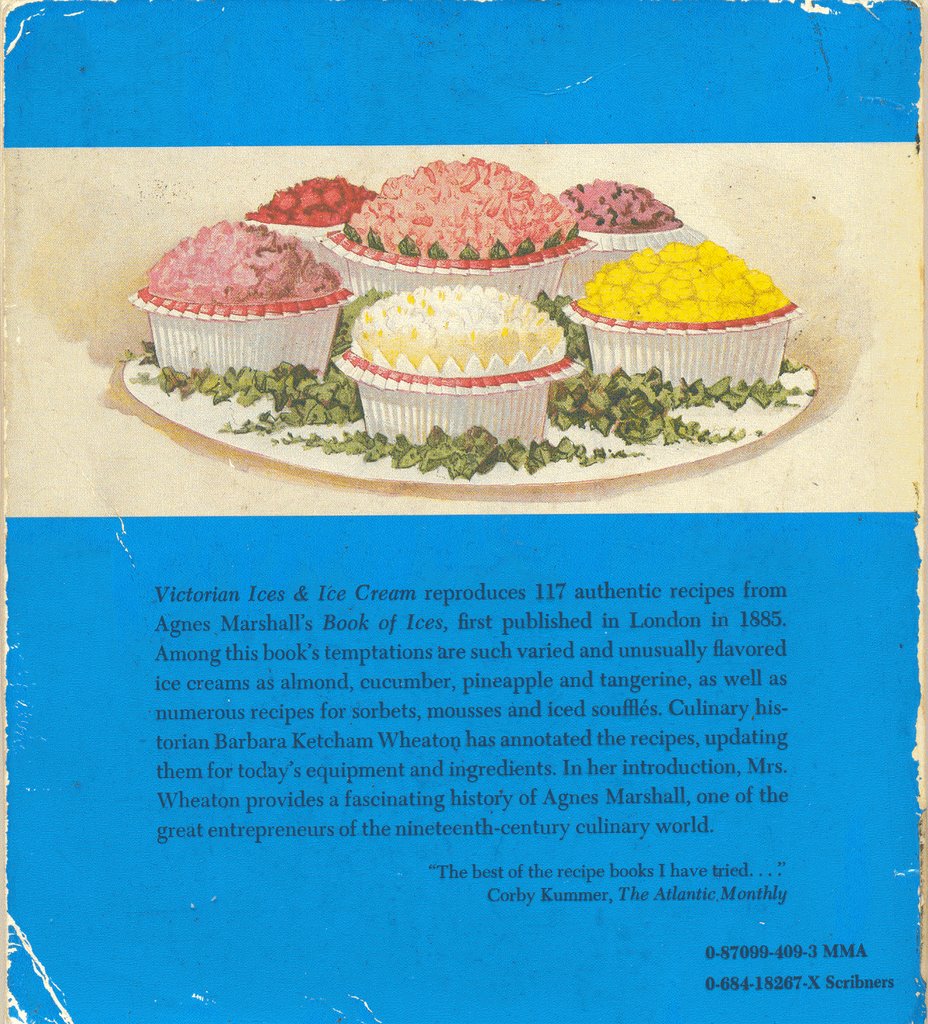 I found this at the library. The title in full is Victorian Ices & Ice Cream: 117 Delicious and Unusual Recipes Updated for the Modern Kitchen: Original Recipes from The Book of Ices by A.B. Marshall, London, 1885. A reprint of The Book of Ices (London: Marshall's School of Cookery, 1885) by Agnes B. Marshall, this edition was published in 1976 by The Metropolitan Museum of Art and Charles Scribner's Sons. The introduction and annotations are by Barbara Ketcham Wheaton and the foreword is by A. Hyatt Mayor.
-----
December 10 update: On a related note, Rose Vesel Mattus, the co-founder of Haagen-Dazs, has died. In 2004 she wrote The Emperor of Ice Cream: The True Story of Haagen-Dazs.
The Notability Criterion of Wikipedia
is what this Washington Post article addresses. Wikidumper rescues articles deleted from Wikipedia. This is another blog about Wikipedia, from a sociological perspective.
Tuesday, December 05, 2006
Vandalism in Canada

Kunstler's Eyesore of the Month for December
"The new addition to the Royal Ontario Museum, Toronto, by Daniel Libeskind-- scoring a two-in-a-row coup for the architect/savant on EOTM. Why are all those people standing around in the foreground gaping at this spectacle? They are from the Royal College of Physicians, trying to figure out a treatment plan. The stuffy old gentleman of a museum has developed a horrendous steel and glass tumor. It has become the "Elephant Man" of museums. Now, you may ask yourself: why is this sort of thing acceptable to the Guardians of Culture? The answer may be that it sends a truthful but subliminal message (which, alas, we are misinterpreting) that the mis-use of technology has become the fatal disease of civilization."
Kunstler also has a link to Dmitri Orlov's report on how the Soviet Union/Russia weathered its economic collapse.
Monday, December 04, 2006
Same As It Ever Was
Hunter Bishop notes that trouble is brewing with the 2006-08 County Council. Pete Hoffman is in charge now. Say what you will about Stacy Higa; at least he was never photographed making this choch facial expression.
Subscribe to:
Posts (Atom)
